Mobile Usage
The user site ships a dedicated mobile web layout: design on desktop, demo to customers on your phone.
Mobile workbench
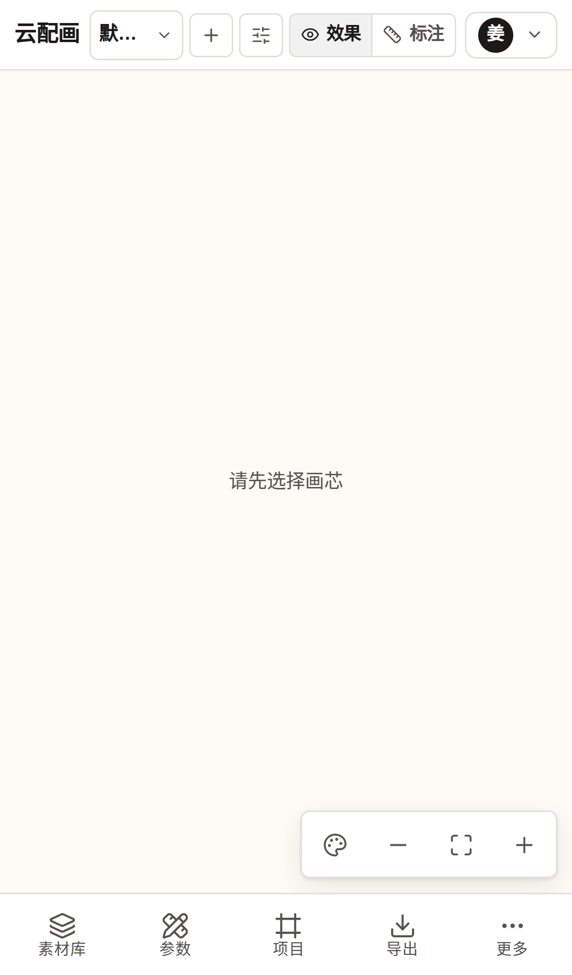
Opening the user site on a phone switches to the mobile form:
- A condensed top bar; library and parameter panels become bottom drawers;
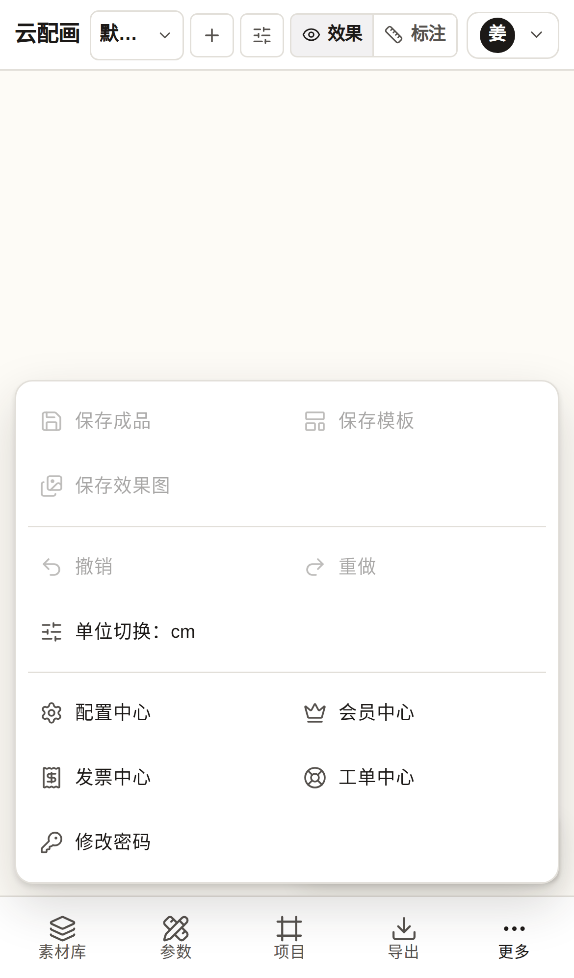
- A bottom toolbar with five entries: Library / Params / Projects / Export / More;
- “More” contains: save artwork / template / render, undo / redo, unit switch, preferences, membership, invoices, tickets, password change.
Scan to open
On desktop, the “Mobile” button at the bottom of the library dock shows a QR code of the current site — scan it with your phone to open the mobile web version and sign in with the same account; data syncs in real time.
Touch gestures
- Stage: one-finger drag to pan, pinch to zoom;
- Wall mode also supports dragging to reposition.